Your menu’s pricing and profitability matrix might be dialed in, but if the design is working against you, all that menu engineering work gets diluted.
Most restaurant operators treat their menu like a Word document with prices attached: a list of dishes, some dollar signs, maybe a logo at the top.
But the reality is that your menu is a critical internal marketing tool—and your guests are forming opinions about it in under two minutes (109 seconds to be exact).
So what should be part of your visual playbook to make a stronger, more profitable menu design?
Key Takeaways
- Your guests spend an average of 109 seconds scanning your menu—where you place high-margin items (and how you visually highlight them) directly impacts what they order.
- Color psychology is a real lever: warm tones like red and orange stimulate appetite and urgency, green signals freshness, and blue suppresses appetite.
- Less is more across the board: limit items to around seven per category, use white space to draw attention to featured dishes, and cap food photography at one strong image per page.
- Small design details compound: removing dollar signs can shift spending by 8%+, italicized fonts signal upscale quality, and descriptive menu labels increase item sales by 27%.
- Menu design and menu engineering are two halves of the same strategy—the visual playbook only works when it’s built on top of solid contribution margin and profitability data.
Why Restaurant Menu Design Matters
Menu engineering only works if your visual strategy is equally strong.
You can have the most carefully calculated contribution margins in the industry, but if your high-profit items are buried in a wall of text with tiny fonts and no visual hierarchy, nobody’s ordering them.
That’s the gap restaurant menu design fills. It takes the financial intelligence behind your menu and makes it work visually, guiding where eyes land, what stands out, and how quickly a guest moves from scanning to ordering. The pretty and the practical have to come together.
According to research from the Culinary Institute of America and Cornell University, even small design changes like how you present pricing can shift customer spending by more than 8%. And the broader principles—color, layout, placement, photography—compound on top of that.
In an industry where operators are battling rising food costs, tighter margins, and guests who are increasingly value-conscious, your menu design is one of the few levers you can pull that costs almost nothing to improve but directly impacts what people order and how much they spend.
So let’s get into how to design a restaurant menu that actually sells.
How To Design A Restaurant Menu
Now that we’ve covered the “why,” here’s the “how.” These are the core design principles that separate a forgettable menu from one that actively drives guest behavior and protects your margins.
Map Where Eyes Actually Go
Before you pick a single font or color, you need to understand how people actually look at a menu, because it’s probably not how you think.
The concept most menu designers reference is the “Golden Triangle.” The idea is that when guests open a menu, their eyes land in the center first, then move to the upper right corner, then to the upper left. Those three zones are considered the prime real estate on your menu, which coincides with the spots where your highest-margin items should live.
That said, the research on this is more nuanced than the industry shorthand suggests.
- The original eye-tracking study on restaurant menus, commissioned by the National Restaurant Association and conducted by the Gallup Organization, found that guests reading a two-page menu actually followed a more book-like pattern—starting at the top left and reading across.
- A study published by the Human Factors and Ergonomics Society confirmed that on color menus, guests tended to fixate on the center first, while black-and-white menus drew eyes to the top left.
The practical takeaway? Your menu format matters. A single-page menu behaves differently from a two-page spread or a tri-fold. But the principle holds: wherever your guests’ eyes land first, that’s where your Stars belong.
And a real-world case study from Texas A&M University’s Human Behavior Lab put this into practice. After using eye-tracking technology to redesign the menu layout for a local BBQ restaurant, the business saw profits increase by more than 20%.
You don’t need infrared cameras to apply this. Start by identifying the natural focal points of your specific menu format, and make sure your best-margin items aren’t buried in a dead zone. Top of category lists, center of the page, and the first thing a guest sees when they open the menu is where the money is.
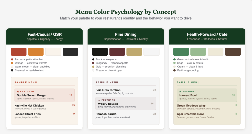
Lean Into Color Psychology
Color is a strong psychological trigger, especially when food is involved.
The palette you choose is influencing your guests’ appetite, mood, and ordering behavior before they even read a single word.
Here are a few things to keep in mind:
- Red is the most powerful appetite stimulant. It increases heart rate, creates a sense of urgency, and encourages faster decision-making. On your menu, use red sparingly for callout boxes, “Chef’s Pick” labels, or accent elements that draw the eye to high-margin items.
- Orange stimulates appetite without the urgency. It’s warm, comfortable, and makes guests feel at ease, which means they’re more likely to linger and order more. It works especially well in casual dining and family-style concepts.
- Yellow catches attention and creates a sense of energy and optimism. It’s effective as an accent color, but go easy, as too much saturated yellow can feel overwhelming.
- Green signals freshness, health, and natural ingredients. If your concept leans into farm-to-table, plant-forward, or health-conscious positioning, green reinforces that message on the menu. It’s a mild appetite stimulant tied to the association with edible plants and vegetables.
- Blue is the color to avoid on menus. It’s rarely found in natural food, it suppresses appetite, and it can make dishes feel less appealing. There are exceptions—seafood-focused concepts can use blue in branding to tie into water associations—but be mindful of where it shows up on the menu.
The key is matching your menu color palette to your concept. Your color choices should feel like a natural extension of your dining room and brand—not a disconnect from the experience you’re creating.
Choose The Right Typography
Your font choices are doing more work than you think.
A study published in the International Journal of Hospitality Management tested how font style, background color, and physical menu weight influence guest perceptions.
The findings were clear: When menus used italicized fonts, diners perceived the restaurant as more upscale and expected higher-quality service. Heavier menus — thicker paper, sturdier covers — had the same effect.
Interestingly, background color (gold vs. white) didn’t move the needle on perceived quality at all.
The lesson? Font and physical feel matter more than flashy aesthetics.
Here’s how to think about it by concept.
Serif fonts —the ones with small decorative strokes on each letter, like Garamond— read as traditional, established, and refined. They work well for fine dining, steakhouses, and heritage concepts where you want to signal quality and craftsmanship.
Sans-serif fonts —clean, modern typefaces like Helvetica or Montserrat— feel approachable and efficient. They’re a natural fit for fast-casual, QSR, and modern concepts where clarity and speed matter.
The best menus pair two complementary typefaces: one for headers and one for body text. A serif for dish names paired with a clean sans-serif for descriptions creates contrast and visual hierarchy without clutter.
A few other rules of thumb:
- Keep body text at 12–14 point minimum, especially if your dining room runs dim.
- Limit yourself to two or three fonts total. And make sure your font choices translate to digital — if you’re running QR code menus or tablet ordering, whatever looks great on printed cardstock also needs to be legible on a phone screen.
- Stay away from script fonts in body text. They might look elegant in a header, but they become unreadable in low lighting at 11-point.
Maximize Your Layout
If typography is what your menu says, layout is how it breathes.
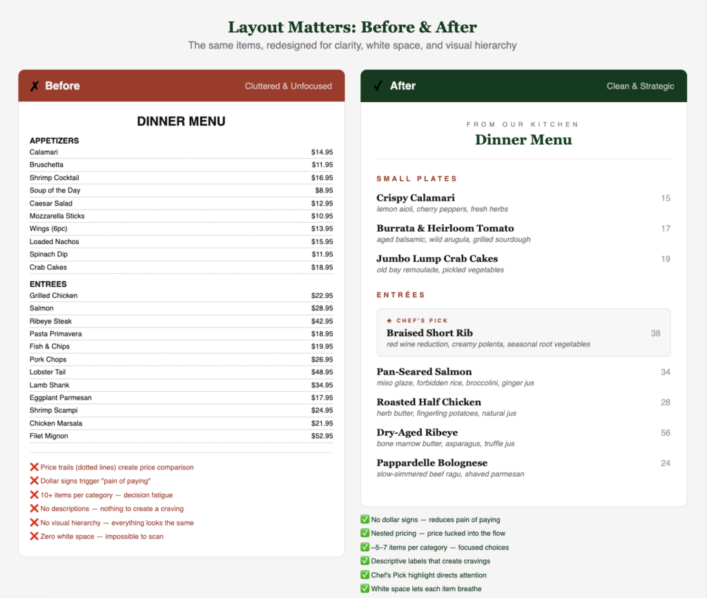
The single most underused tool in restaurant menu design is white space. Also called negative space, it’s the blank area around text, images, and sections. When a menu is crammed edge to edge with items, descriptions, and prices, everything competes for attention and nothing wins.
But when you create intentional breathing room, especially around the dishes you most want to sell, those items naturally pull the eye.
Then there’s the question of how many items to include. The psychological principle here is the paradox of choice—the more options you present, the more anxiety guests feel, and the more likely they are to either pick something safe or take longer to decide. The widely cited sweet spot is around seven items per category. That’s enough variety to feel like a full offering without triggering decision fatigue.
Structure your layout to follow the natural flow of a meal: appetizers first, then entrees, then desserts. And organize within each section intentionally: place your highest-margin items at the top and bottom of each list, since research on the primacy and recency effect shows those are the positions guests remember and order from most often.
Use Smart Visual Cues
Once your layout is clean and your items are positioned intentionally, the next step is using visual cues to make certain dishes impossible to miss.
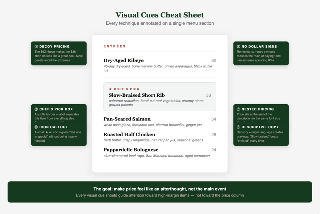
Boxes, borders, and shading are the most common tools here, and they work. When you put a subtle border or shaded background around a dish, it visually separates that item from everything else on the page.
Employ Visual Pricing Strategies
This is also where the decoy effect earns its place on your menu.
The idea is simple: place a high-priced item near one of your high-margin Stars. That $62 dry-aged ribeye isn’t necessarily there to sell in volume; it’s there to make the $38 braised short rib next to it look like a great deal.
Most guests naturally avoid the most expensive and least expensive options on a menu (a behavior psychologists call extremeness aversion), so a well-placed premium item pushes orders toward the profitable middle.
Then there’s how you handle pricing itself. A few rules that are backed by research from theCIA and Cornell University:
- Ditch the dollar signs: Removing currency symbols reduces the psychological “pain of paying.” Instead, use nested pricing where you place the price at the end of the item description in the same font and size so it doesn’t jump off the page.
- Never use price trails: Those are the dotted lines connecting dish names to prices. They don’t work because they turn your menu into a price comparison chart and send eyes straight to the cheapest option.
- Avoid column lining pricing for the same reason.
Be Strategic With Photography
A well-shot photo of a dish can increase its sales by up to 30%. But a menu packed with low-quality images can hurt your brand perception and make your restaurant feel downmarket.
The research is consistent here: less is more. One strong, professionally shot image per page is the sweet spot. It draws the eye, creates a craving, and gives that specific item a massive advantage over everything else on the page.
Be careful with quality here. If the food in the photo doesn’t look like what’s coming out of the kitchen, you’ve created an expectation gap that leads to disappointment, not repeat visits.
For concepts where professional photography isn’t in the budget, skip images entirely and invest in stronger descriptions instead (more on that next). A clean, text-driven menu with great copywriting will always outperform a menu cluttered with mediocre phone photos.
And don’t forget that if you’re using QR codes, tablet ordering, or online menus, the same rules hold. Digital gives you the added advantage of updating images seasonally without reprinting, so take advantage of that flexibility.
Use Your Words Wisely
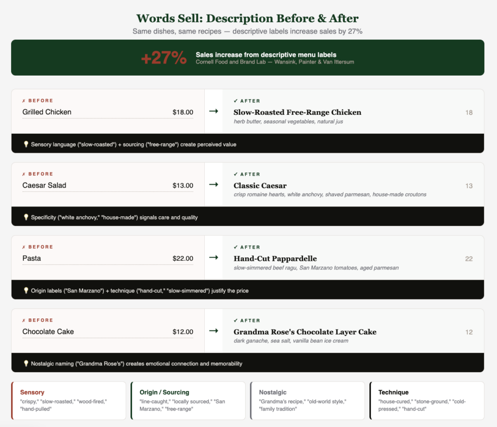
A landmark study from the Cornell Food and Brand Lab found that menu items with descriptive labels saw sales increase by 27% compared to items with plain, generic names. Not only did guests order more of the descriptively labeled items, they also rated the food as higher quality and a better value after eating it.
So what makes a good description? It comes down to a few categories.
- Sensory language paints a picture: “crispy,” “slow-roasted,” “hand-pulled,” “wood-fired.” These words engage the imagination and make the guest experience the dish before it arrives.
- Nostalgic and origin-based language builds emotional connection: “Grandma’s zucchini cakes,” “line-caught Pacific salmon,” “locally sourced heirloom tomatoes.” These signal authenticity, care, and quality without needing to say “premium” or “artisanal” (words that have been overused to the point of meaninglessness).
One thing to avoid is superlative claims. “The world’s best burger” doesn’t land, guests know it’s not true, and it undermines your credibility. Instead, let specificity do the work. “Our double-smash burger with aged white cheddar, house-made pickles, and toasted brioche” tells guests exactly what they’re getting.
Great Restaurant Menu Design Starts With Knowing Your Numbers
Your menu design is only as strong as the financial strategy behind it. When the visual side and the financial side work together, that’s when you see real results. Get matched with a restaurant-specialized CPA and make sure your menu is pulling its weight both on the page and on your P&L.